Meijer
Meijer is a large grocery and consumer goods company located all throughout the Midwest. While at Meijer, the company was transitioning from Hybris to AEM and while that transition happened, a lot of site wide updating and new feature additions were tasked. I worked on multiple digital products and experiences which included: order details/confirmation experience, PDP updates, out of stock experience, order history experience, holiday season special buy pages, an internal software used by business analysts and more.
Post Purchase Experience
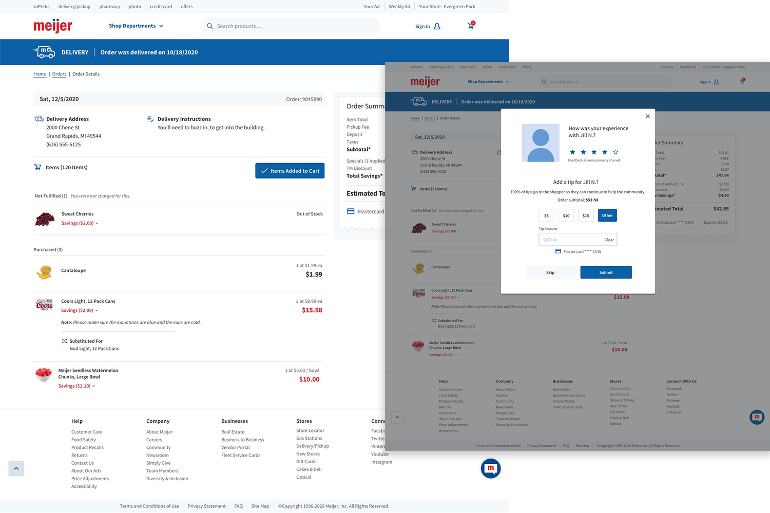
Project Overview
One of my first projects I received joining the digital team at Meijer was enhancing the post purchase experience for meijer.com.
Meijer had recently adopted “deliver to home” to their website and lacked a detailed experience for users when they place a delivery order, and how they interacted with those drivers as well. Displaying the history of these orders also needed to be captured.
Role: UX/UI Designer
I was responsible from taking feedback from our UX research team and creating this experience. Creating the vision and delivery were my priorities. I had to make sure these new designs fit into the already existing design system of meijer.com.
Customer Problems
COVID19 had changed the delivery industry increasing the demand for food delivery. Customers need a safe and efficient delivery practice for necessities.

I designed and launched a post purchase experience within meijer.com.
Outcome: I successfully delivered all touch points necessary to complete the post purchase delivery experience.
I tracked this journey using user flows
I began with very low fidelity sketches and finished with finalized high fidelity prototypes
I delivered multiple solutions testing to make sure we moved forward with the best solution for the users.
Highlights
Who I worked with throughout this project:
UX Research Team
Front End Developers
Back End Developers
Product Owners
Business Analysts
Engineers
Step 1
User Flows
As an avid online shopper, I can attest to the importance of a seamless post-purchase experience. It is not enough for e-commerce platforms to simply focus on converting shoppers into customers; they must also prioritize providing a delightful and hassle-free journey after a purchase has been made. This is where creating user flows for the post-purchase experience becomes crucial. Key areas such as order confirmation, confirmation emails, order cancellations, order tracking and delivery updates, communication with driver, support and help, reordering, surveys, account management, etc. all need to be accounted.

Step 2
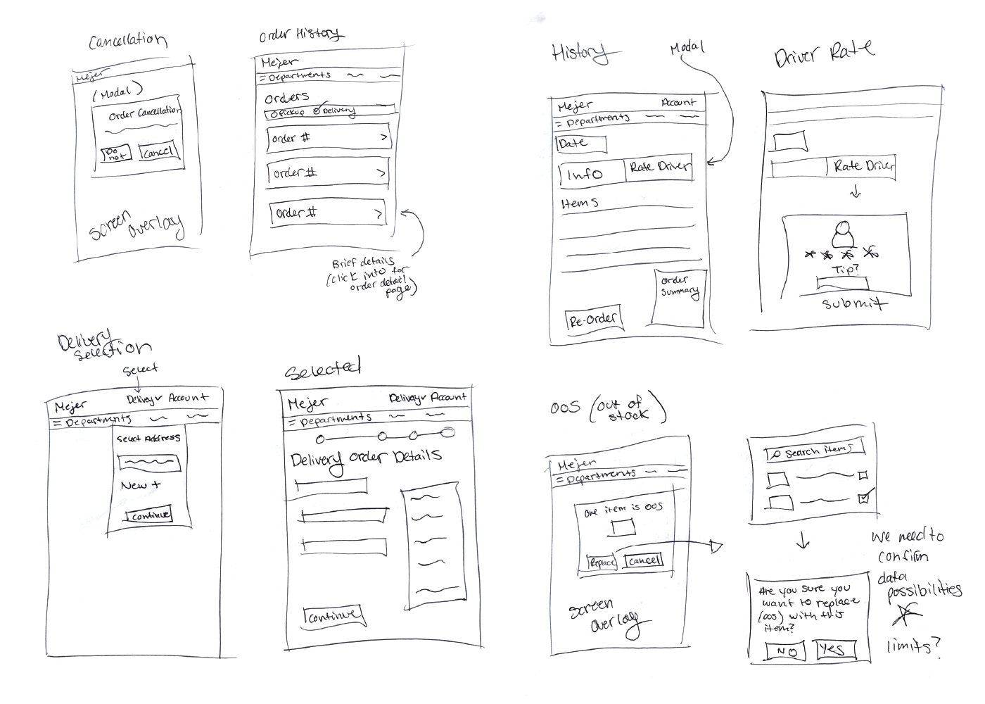
Sketching
I began sketching out the ideal post purchase experience. My sketches incorporated various elements and considerations that needed to be addressed to ensure a seamless and satisfactory journey for users. First and foremost, I aimed to bolster the clarity and efficiency of the process for placing a delivery order.
Next, I turned my attention to the interaction between users and the delivery drivers. I wanted to ensure that customers had a transparent and convenient way to monitor the status of their order and communicate with the driver when necessary.
Additionally, I recognized the importance of capturing and presenting the order history to customers. I sketched out a comprehensive order history section that not only provided a detailed record of past purchases but also allowed users to easily reorder items, rate their experience, and provide feedback.
Step 3
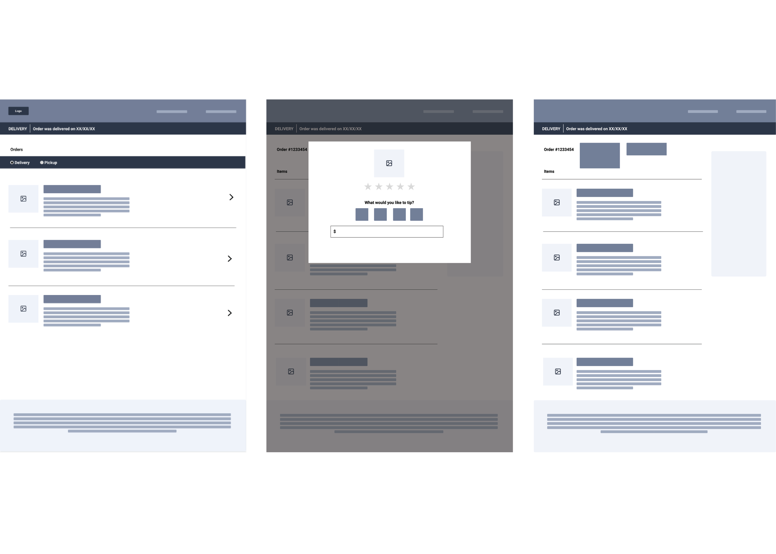
Wireframing
The first step in creating wireframes for the post-purchase experience is to define the primary objectives and key actions that users should be able to take.
The wireframes had to take into account the visual hierarchy and layout of the screens, ensuring that important information and actions are prominently displayed and easily accessible. Clear labels, icons, and buttons can guide users through the various steps and options available to them.
By visualizing and refining the user flows, the wireframes provided a blueprint for designing the intuitive interfaces and addressing the diverse needs and expectations of users. By prioritizing a delightful post-purchase experience, e-commerce platforms can build strong customer loyalty and advocacy, setting themselves apart in a competitive market.
Step 4
Testing
Testing different solutions is key to providing the best solution for the user. Whether it is an A/B test or just some generic moderated/unmoderated test or surveys, I believe they are necessary to have a successful experience. For this stage a few different option were run through an unmoderated generic test and the results helped me narrow down the best directions to move forward with.

Step 5
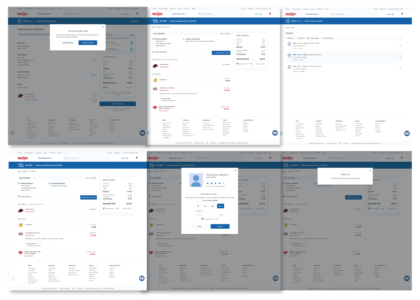
High Fidelity Protoyping
To ensure a successful implementation of post-purchase features, I turned to high-fidelity prototypes as a powerful tool for refining and perfecting the customer journey. The high-fidelity prototypes represent a detailed, near-realistic representation of the final product experience
Step 6
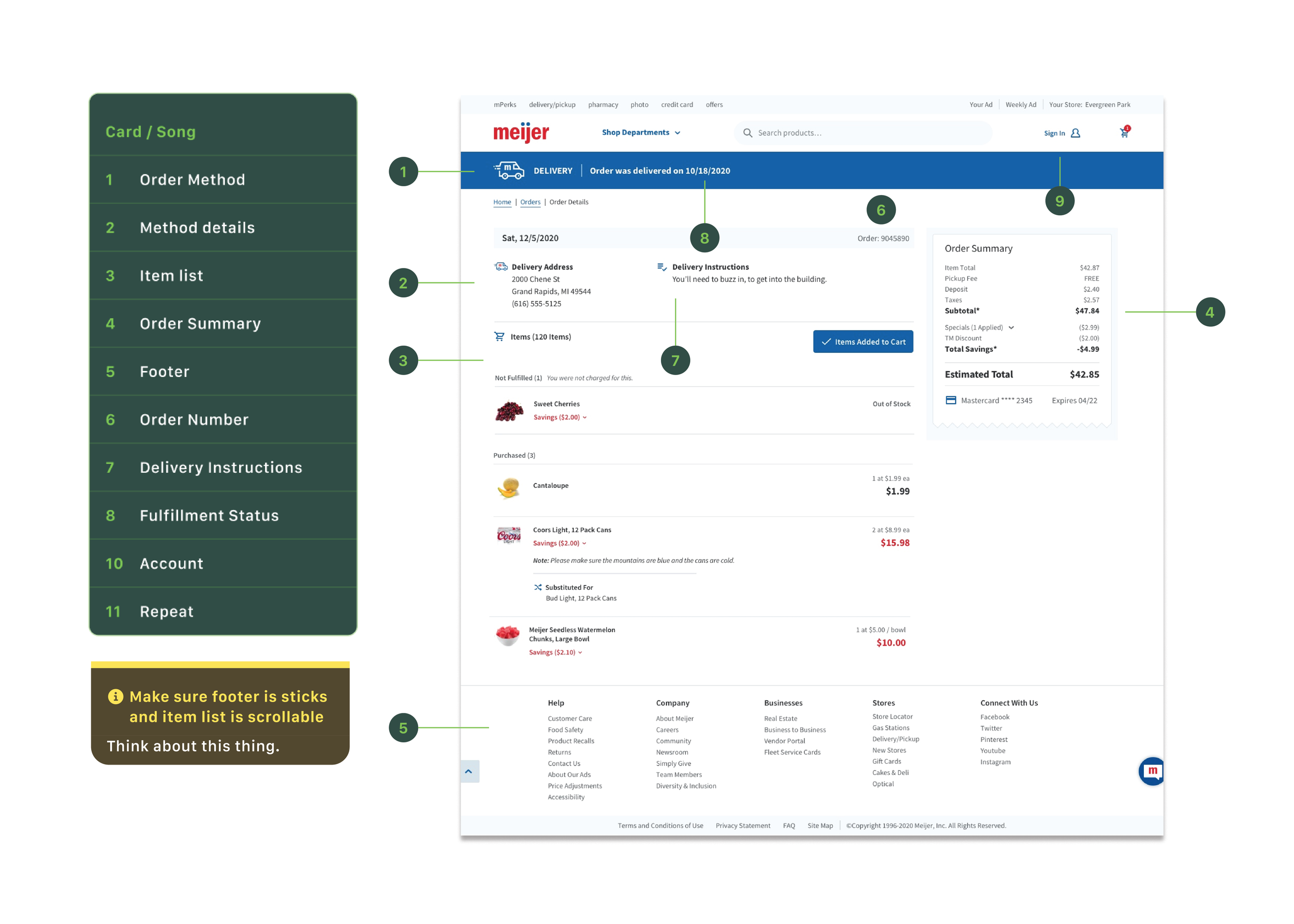
Developer Handoff
I worked with the development team daily so they have transparency and collaborate with the UX team throughout the lifecycle of an idea.
That being said, as the owner of the UX product, I make it a practice among my UX team that we provide certain deliverables to the developers, such as:
A11Y markups
information architecture diagrams
annotations, callouts, spacing
clickable prototypes
Takeaways
Throughout this project from beginning to end, it is clear that without focussing on the following key areas, the customer experience would not be successful:
