Trek Ride Club App
Project Overview: Trek Ride Club App
One of the biggest projects I have been a part of at Trek is the new “Trek Ride Club” app. Trek did not have a have a brand app to enhance customer engagement with the Trek brand. To solve this, a large team and I created a biking engagement app to immerse customers into the biking lifestyle.
Role: Digital Product Design Lead
I have been the lead designer for this app from end-to-end and beyond. I am in charge of the entire experience form an UX/UI standpoint, including the UX roadmap for the product, research, strategy, testing and iterating, vision, delivery, and post launch retrospective of this new app. There is one other designer helping support the web version of the app that uses Treks current design system.
Additional Problems to Solve
Customers do not have access to a Trek branded bike app (outside of our e-bike specific riding app).
Customers have no way of recording bike rides and receiving ride performance metrics from a Trek branded experience.
Customers have no way of engaging with their biking community from a Trek personalized standpoint.
Our retailers are looking for more touch points in their sales process to engage customers.
Customer Problems
Vice President of Marketing
Vice President of IT
Graphic Design Team
Product Data Manager
Marketing Managers
Store Managers
Copywriting
Who I worked with:
Product Owners
Front & Back End Developers
Q&A
Business Analysts
Engineers
Software Architects
Project Managers
Step 1
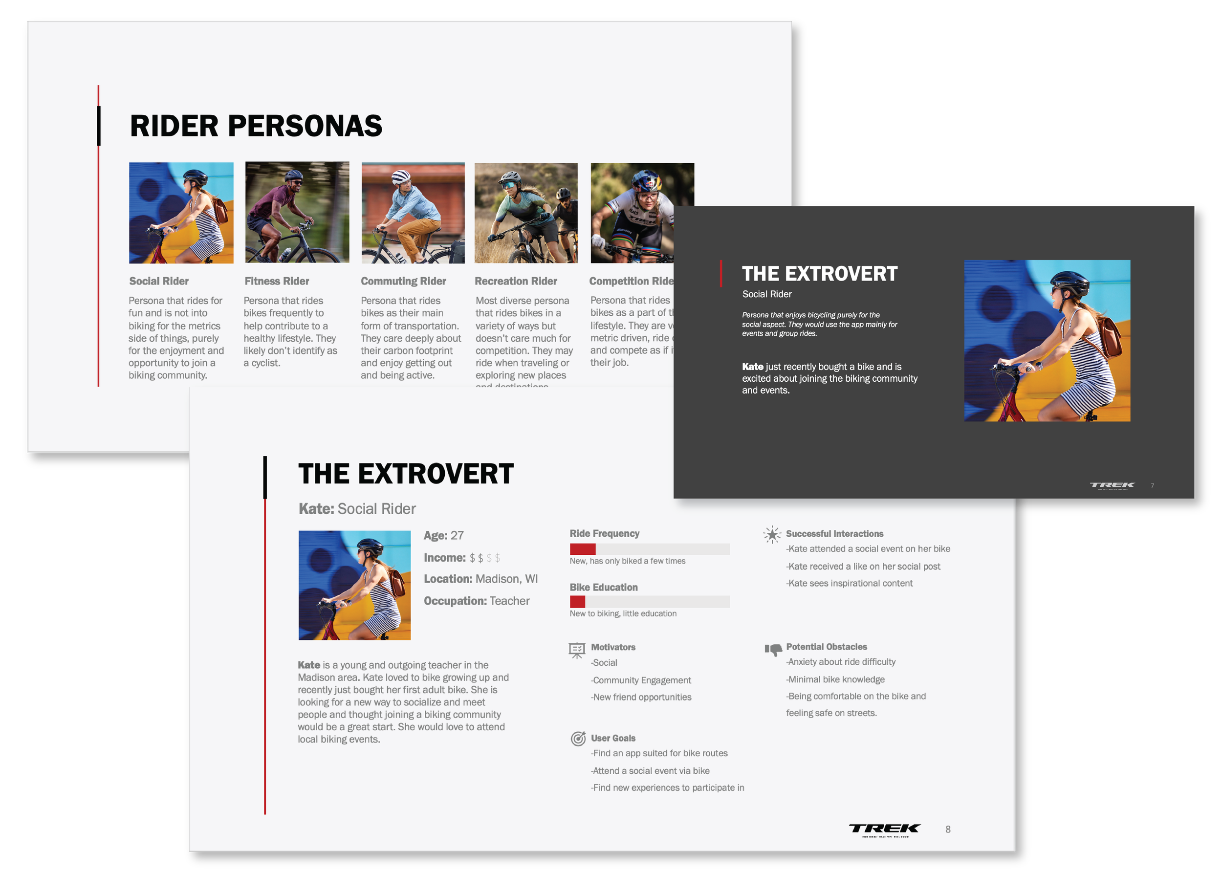
Understanding our users
User personas played a pivotal role in our successful product development and marketing strategies. These fictional representations of target users helped us gain a deeper understanding of our customer base, allowed us to design products and tailor experiences that met our users' specific needs.
Step 2
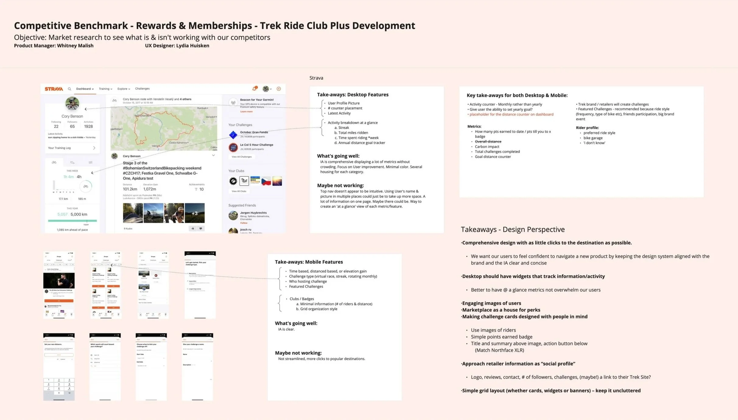
Research & Benchmarking
Where to begin! With an app of this size, it was very important to do an extensive amount of research and benchmarking. Benchmarking was key in understanding where our competitors stood and to gain some best practices to use. I also did a deep dive into what feature sets stood out and what could be prioritized.
Step 3
Interviews
The next key step in this project was gathering information from a panel of potential users. Gaining insights on what users want out of the app and how they would interact with it helped on stay on track.

Step 4
Aligning the UX/UI process and capabilities with the project Roadmap & larger process
Once a decision was made on the broad feature set of this product between my research done by my product owner and I, the project roadmap was created. I was responsible for working with the business analysts and development team to make sure the UX/UI timeline of deliverables would be on target and align with development needs. This projects had a very short project timeline, so we worked together to break the project into phases.

Step 5
Getting Setup
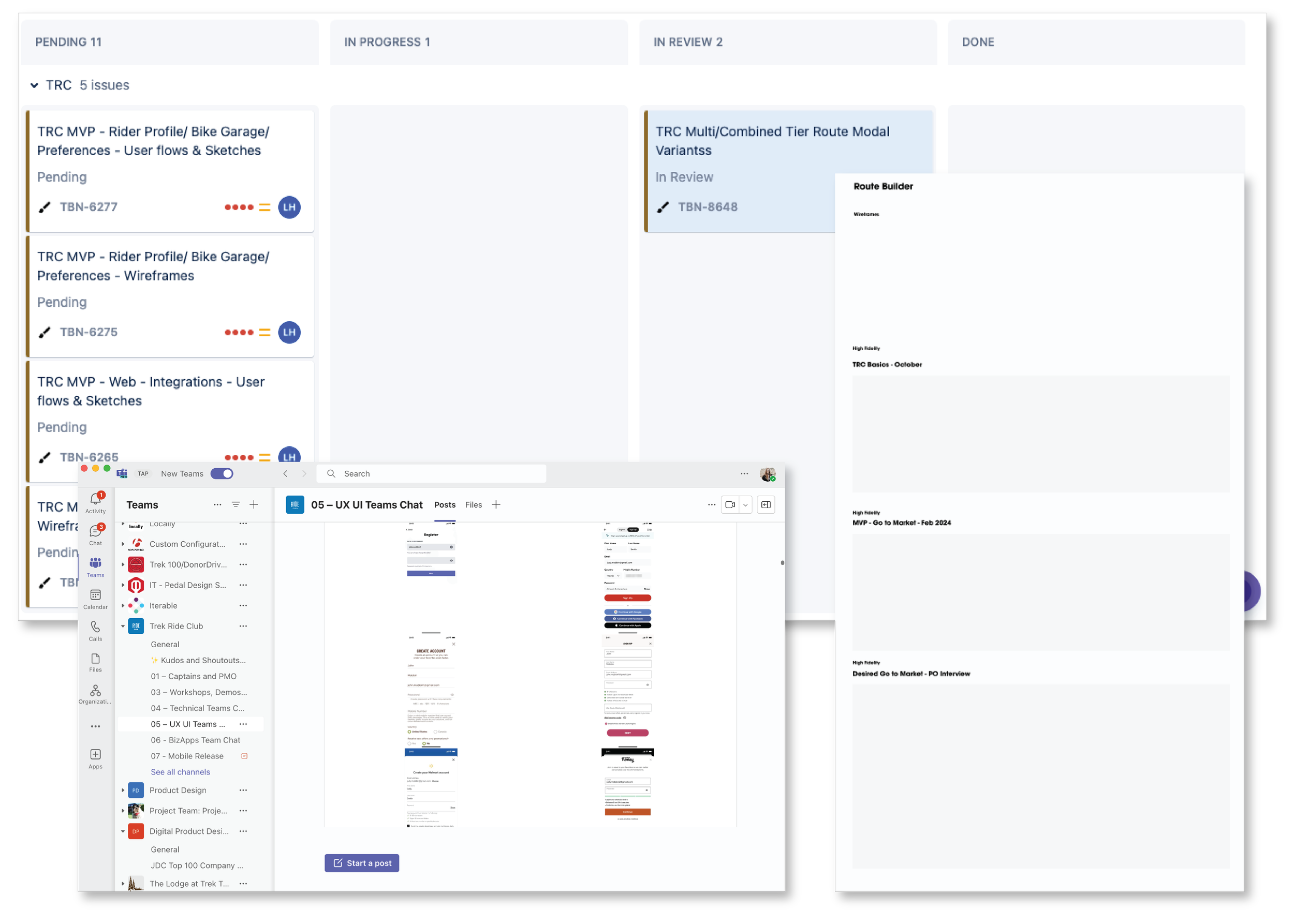
I first added a specific swim lane to our UX/UI design board for all tickets surrounding design work for Ride Club that also directly linked to the project board itself containing the development tickets. I also made sure we had a specific UX/UI channel within the project team for communication and also a Figma setup representative of the phases to help make an efficient handoff to the developers. We also had a confluence section of key documents created by the business analysts and project manager.
Step 6
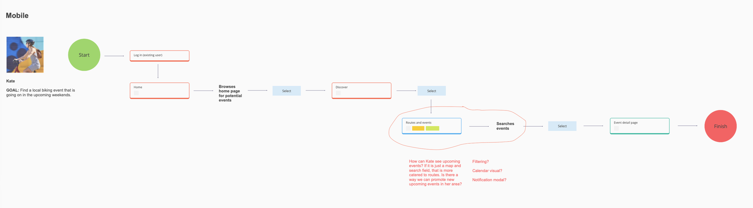
User Journey Mapping
During this phase of the project, under my lead but with the help of my product owner, we mapped out the user journey based on our gathered research and requirements. This involved understanding the needs and pain points of our target audience, exploring potential solutions, and structuring the flow.

Step 7
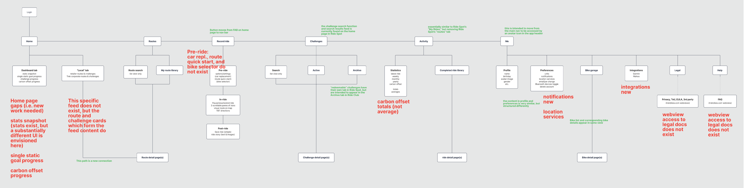
IA (Information Architecture)
Establishing a thorough structure of this app for both web and mobile was very important to making sure it was feasible from the back end development side of the app, and that there was an efficient and successful user flow throughout. These architecture maps established the foundation of the app.

Step 8
User Flows
At this point I had my user personas flushed out as well as a solid architecture map so I was able to begin user flows so I could then start sketching out the app and begin wire framing.

Step 9
Wireframing
After user flows, I began designing the basic structure and functionality of the app, focusing on the placement of elements to help give a visual blueprint without diving into branding. It was very key to defining what components were needed and how the feature sets would fit.

Step 10
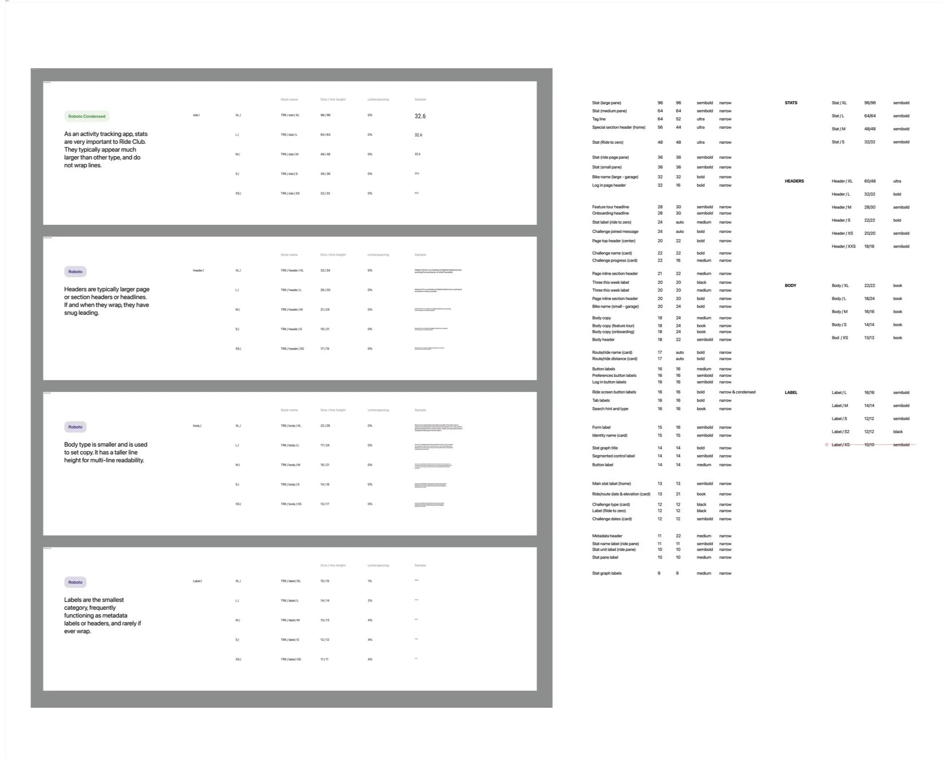
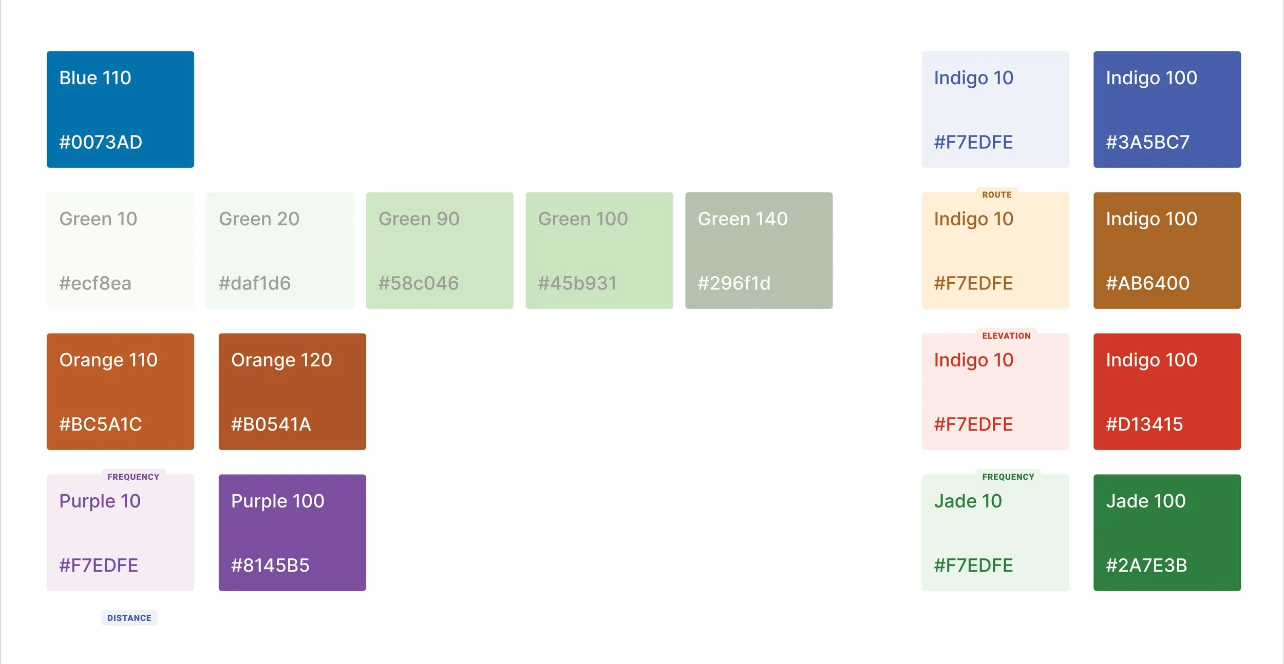
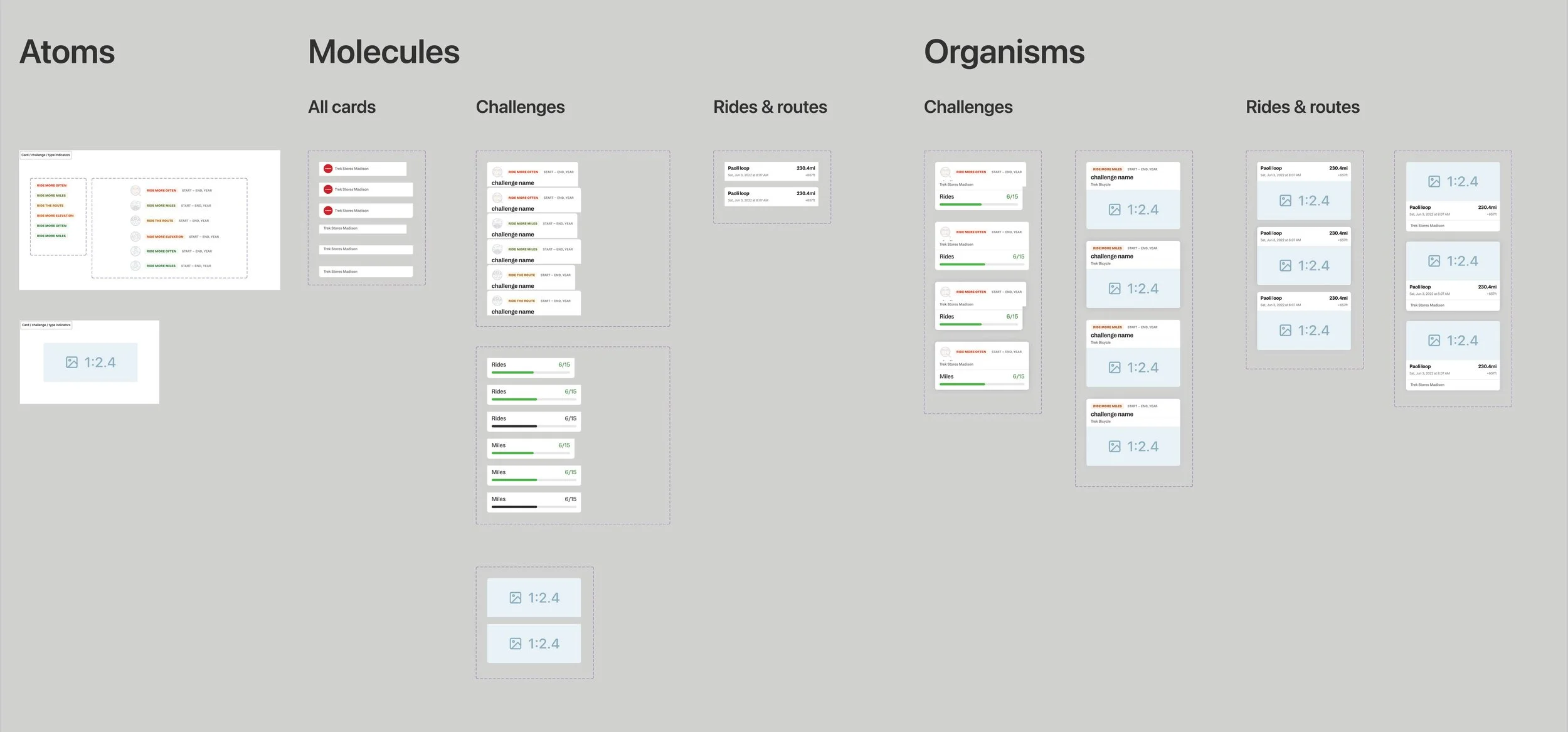
Design System
Our first Trek branded App! With that being said, we do not have an app based design system. As part of this project, it was necessary to begin the initial bones of an app design system. The essentials for the first couple phases are typography, color, and components. Treks visual design teams handled the illustrations.
Step 11
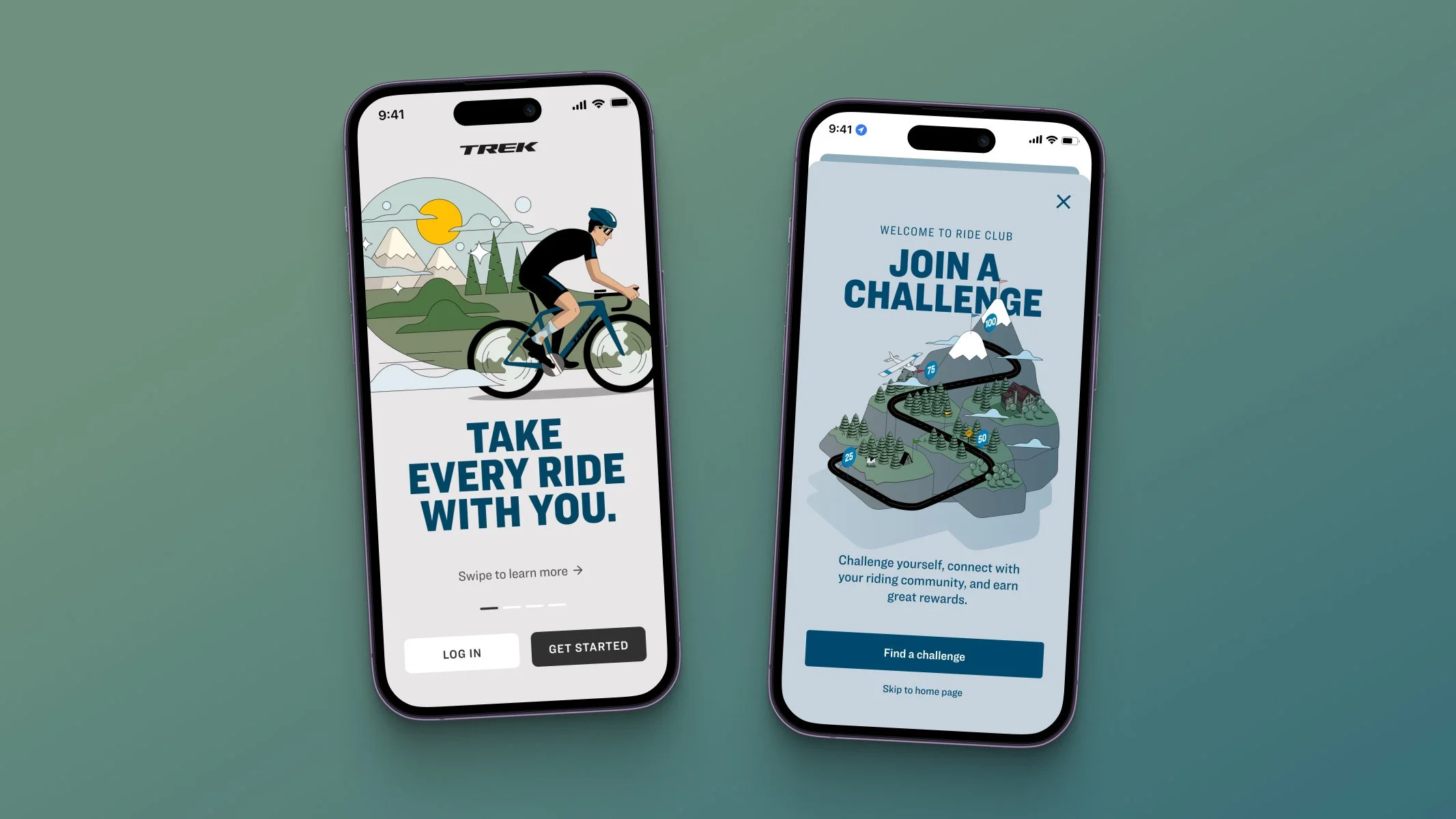
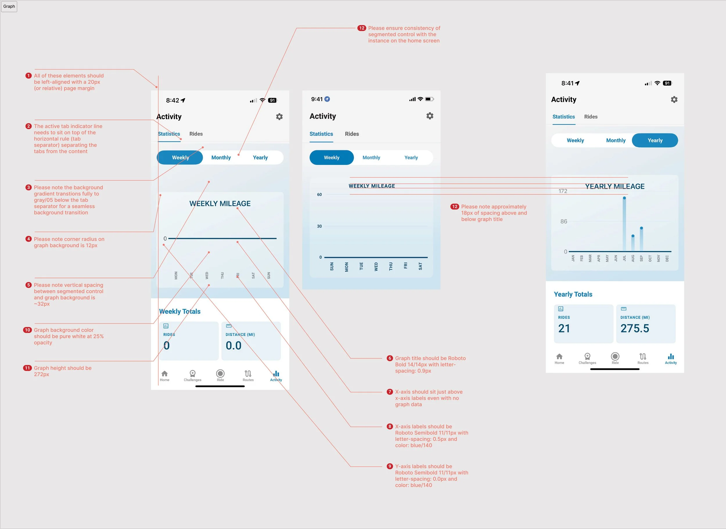
High Fidelity Screens + Design QA
High fidelity screens were created and annotated for developers. These screens include precise visual elements, interactions, and user flows that closely represent the finished product.
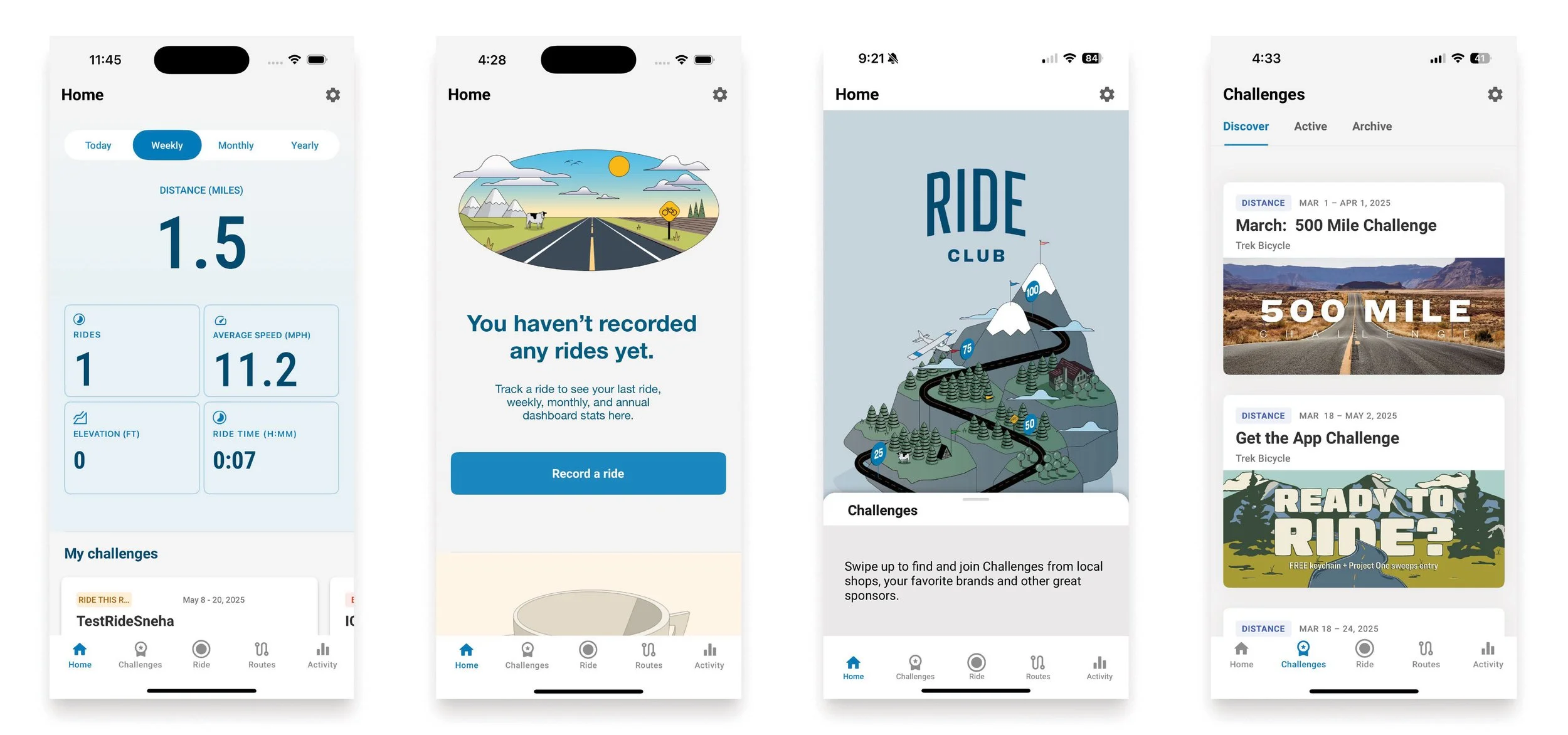
Launched!
Steps not shown above
This page could go on for far too long, there are steps and parts to the project not shown. Please ask me more about the following that were part of the project and process:
Translations
Animations
Clickable prototypes
UAT Internal (User Acceptance Testing)
Android design
Web app